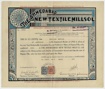
Since the 1900s Indian security printers developed their own lettering styles and ornaments. Distinguishing themselves from the British design tradition, their work resulted in a unique range of bond and share certificates.
Here is an example from The Ahmedabad New Textile Mills Co. Ltd: a one 4% (Free of Income Tax) Redeemable Cumulative Second Preference Share of Rs.50, issued on 1 March 1947.
The Ahmedabad New Textile Mills Co. Ltd was established in 1916 by Jivanlal Girdharlal. In 1923 the neighbouring Zaveri Spinning and Weaving Mills was taken over. ANTM produced saris, dhotis, voile and the like. After World War II it had more than 900 looms and provided work to 2,000 employees.
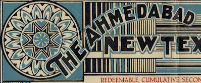
Have a look at the circular geometric pattern in the upper left corner of the share certificate. In that figure, the middle circle is formed by a black line.
Can you notice that the first word of the company name, namely 'The', blends in perfectly? The circle's black line changes into the color blue and connects at the same time with the blue outline of the black T character.
The image tricks your eyes. We still see a full circle. But take away the T-letter, and the circle is broken. Remove the circle and the T is incomplete. Great, isn't it.
F.L.
Previous posts


No comments:
Post a Comment